
Exercise 2.4 Developed and composed samples
- Juliet
- Dec 7, 2018
- 2 min read

Updated: Feb 22, 2019
The aim of this exercise is to explore the evaluation, selection, development and refinement in the design and making process, using two different drawings.
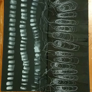
Start exploring the possibilities of the next drawing: looking at the layers of colour and the tidemarks created by the white ink as it has dried on the black paper. This suggests using layers or rounds of of stitching. Use running stitches on scrunched paper towel to try to create the matte black of the background, with the idea that the remaining white will stand out against it, but not very satisfied with this as it doesn't seem to adequately link back to the original drawing, so park this idea for a while to consider next steps.

Decide to use A4 matt black paper, cut in half and stitched together as a long strip to echo the vertical movement in the markmaking of the original drawing; seems to suggest to me a pleating that varies in direction down the length of the paper.

Exploration of a few different ways to interpret this in stitch, Sketching to work out possible ideas; trials using machine and hand stitch; sample next to original drawing; machine stitched using graduated grey polyester thread; again, reverse has some interesting effects, reminds me of texture of bark; final sample reminiscent of a stand-up collar of a garment.


Back of the paper stitched piece quite interesting as it creates raised bumpy texture. Interesting that a non-organic form (necklace) translates into what could be seen as an organic shape reminiscent of razor clam or mussel shells. Are we innately drawn to organic shapes? Have I unconsciously made the shapes more organic for this reason?
Decide to focus next on detail of one of the drawings of lace pattern:

Use torn scraps of reused envelopes as their gridlines appeal to me for this sample, attached to a greaseproof paper base (to introduce element of translucence and fragility) using only stitch in black cotton thread; seen below also in closeup and against the window to see the effect of the translucent base paper and the more opaque squares on top.


Comments