
Assignment three: Colour communication
- Juliet
- Apr 24, 2019
- 6 min read


Aims:
Employ a process of evaluation and selection of your own work.
Demonstrate effective design, layout and presentation skills in the visual communication and presentation of your work.
The brief was to use the work from Projects 1 and 2 to develop and create a beautifully presented colour resource book.
Evaluation: How did I do this?
Selection criteria:
Where I thought I had answered the brief of the exercise most fully., even if I had had found it technically difficult.
Selected and presented what I judged to be the more interesting, pleasing and successful pieces of work from each of the four exercises.

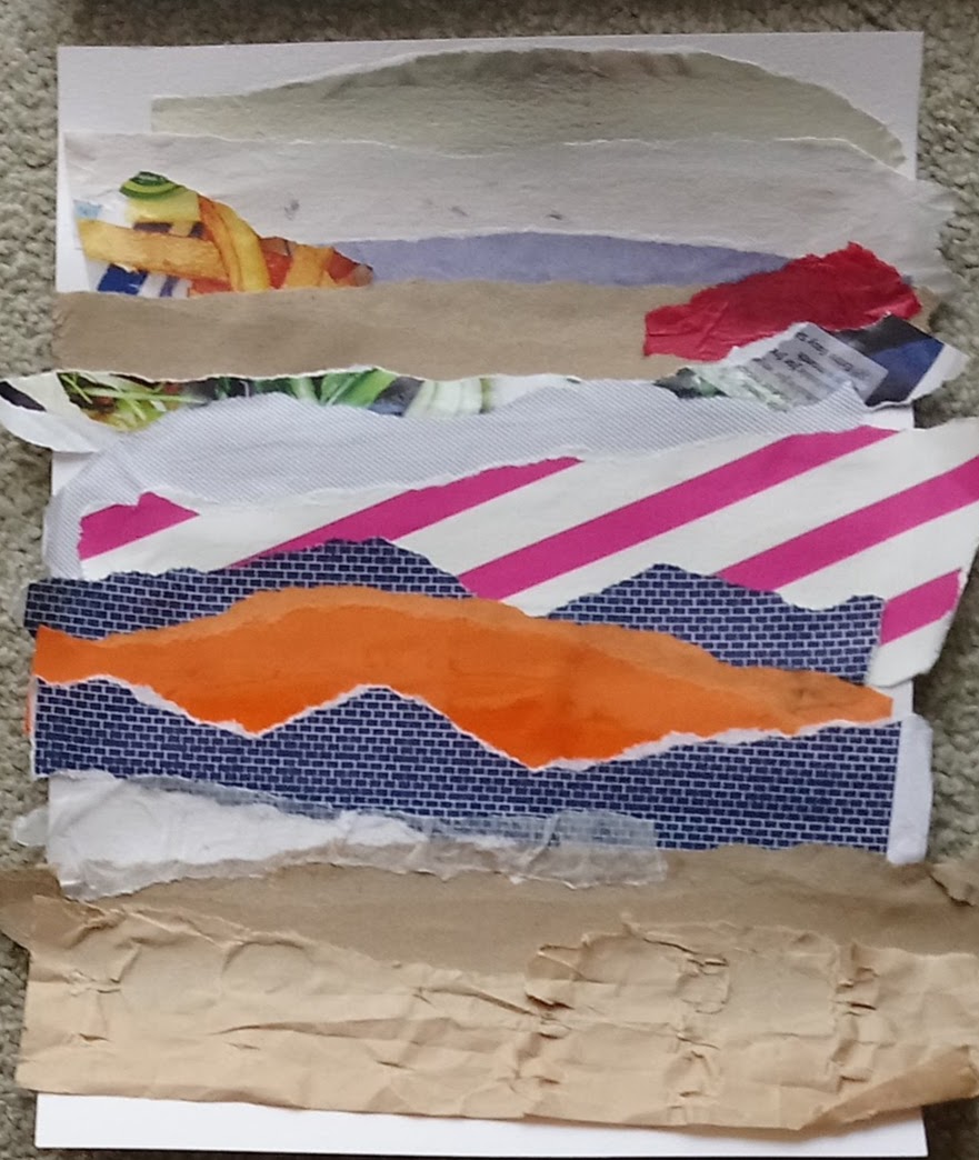
Most of my work from these four exercises I included in this book, but there are three pieces that did not, as I did not feel are some of the pieces that did not make it into the book. The yarn wrap I did not think was technically as good as those that I included and the two collages I did not include as I did not think they were are strong as the one that I developed further in the exercise:


Effective design: How did I do this?
Broke the book down into the sections that correlated to the separate exercises, in order to show the processes I had followed and the results I had achieved.
Thought about the structure of the book and what would be on each page, as well as allowing space between the items and sections, in order to give the content space to breathe.
Used skills and knowledge that I have learned from my profession as a book editor to plan the pagination, with section openers starting on a righthand, or recto, page, according to established book and newspaper design principles.
Initially thought I would include my raw research on colour palettes, but decided against this as wanted to concentrate on my own work, which was confirmed by rereading the assignment brief.
Next I considered the page design and physical construction of my book in order to present my work in a way that was sensitive to the material, as well as attractive to look at, in order to draw the reader (or observer) in.
I did some research using books and YouTube videos on bookbinding and art book construction. My main reference points were Making Books, by Simon Goode and Ira Yonemura, Pavilion Books Company Ltd, 2017 and DIY Single Sheet Bookbinding Tutorial | Sea Lemon
As preparation for creating my book, I tried a simple three-hole pamphlet technique from Making Books (Goode and Yonemura, 2017), as well as reading about the different formats and construction techniques to try to work out which would be best for my material.
I knew that some of the work would create extra bulk on the page, so that not all pages would lie flat. I also knew that I wanted to use double-page spreads effectively in order to show progression and show the links and contrasts between different pieces.
I was also aware that it would be hard to predict the spine depth required, due to the nature of the content, so settled on a book format with an exposed spine binding, which I thought would also be visually appealing with its stitching bringing the covers and the content together.

I decided I would use a the sampling process, in order to test my book design ideas, before I risked the time and materials required to make the final book. I made a mini book with the sample materials and construction technique. This also gave me the opportunity to become more familiar with using the bookbinding tools and methods.


I wanted to develop a strong back and front cover, with a distinctive look and feel. I decided to use one of the fabrics that I had used for the exercise on gouache studies, as I felt it was a good link to the content inside, had a nice soft and warm tactile quality, because of the brushed cotton that the design was printed on and was pliable enough to be suitable for gluing to my front and back covers.

I also chose to use a similar text style on my front cover as I did for the typed text inside – Courier New. For the title Colour, I decided to cut out the letters from the cover material, and considered various options for indicating the word 'colour' on the cover:
Should each letter be a different colour would that be too hard to read, especially against the coloured background I had already selected?
Could I incorporate one of the other fabric samples that I had used for one of the exercises (or that I had rejected)? Again, I thought this might conflict with the parts of the cover that I had already decided upon and would go against the recommendations for simple but beautiful presentation of the work.
So I decided that the key word Colour would appear in the absence of colour by placing this on a white background cotton material, cutting out the letters with a scalpel and adding simple running stitch by hand around each letter to emphasise the outline.
The subtitle A resource book I chose to 'write' using black machine stitch, incorporating this into a border around the edge of the front cover. Again, I tested this beforehand on paper by photocopying the fabric and cutting it out.
It was harder than I expected to do the black machine stitch lettering, and I couldn't achieve as much control as I had envisaged beforehand, but I still think it is quite effective and makes for an original cover for the book.
I wanted to draw the sections of the book together by utilising the cover material on the section openers, so again used the photocopied fabric as ‘paper’ from which I cut out organic shapes that extended into tabs, to make it easier to find where each section started, without the formality of page numbering.

I decided to use a large, wiro-bound, landscape format sketchbook as my base material for my book as it was good quality paper of a suitable colour, thickness and finish; provided sufficient space to attach my work, much of which was up to A4 in size; and it was easy to detach sheets of paper singly in order to add to my book.
I needed to trim both the pages and the cover boards to get the format I required for my book.
I decided to make up the pages as per my plan individually first, before binding them into the book, in order to be able to correct any mistakes that I made more easily. This, coupled with the variety of thicknesses of each page, meant that I needed to use the single page bookbinding method. This construction method makes it possible to add further pages later if desired, but has the advantage of not looking unfinished as is.

I experimented with different ways of displaying the work, using fold-out pages, attaching with cord and making pockets within the book. My idea here was to introduce elements of interactivity, so the person reading the book was more than merely viewing it, but also holding it, touching it and discovering the content, in order for it to be more exciting, like a children's lift-the-flap activity book.

Collage pages fold out to show together the collages that developed from a common source:

Some of the most useful practical things I learnt about bookbinding from my reading and online research were:
Leaving glued covers to dry overnight under a weight to stop them from buckling as they dried.
A form of stitching/knotting to bind in the individual pages and allow them to lie flat when opened.
The fact that bookbinding thread is waxed makes it less likely to get tangled.
The usefulness of bulldog clips for keeping papers aligned.
The importance of measuring and lining pages up squarely on the cutting board in order to keep the pages the same size.
In a more general sense, I also think this assignment helped me value my own work a little more, as if felt more special to be preparing it for publication in book form, rather than just sending it as a bundle of drawings to be looked at separately. I think I handled it differently, and with more care, as I knew that I needed each page to be fairly smooth and clean in order to look good in my book.
Once I had decided on the content, I approached the task of organising it within the book with a fair amount of confidence, as my day job is as an editor, so I had transferable skills in this area. I also work with graphic designers, so I felt I could apply some of what I have observed them doing.
As far as actually making a book, though, this was a first, but I enjoyed the research and sampling process, as well as the actual making of 'my' book and would like to do more of this in future.


Comments