
Research point 1
- Juliet
- Mar 23, 2019
- 2 min read

Store your research and written reflection on it in your learning log.
Voyage Decoration
Collected some information, thoughts and imagery, looking specifically at colour palettes:

Some key words I picked out from the Voyage Decoration descriptions of the different ranges, each with their own colour palette:

Very painterly feel
Lots of alliterative language used in descriptions: fabulous florals, lively and luxurious, blooming botanicals, flourishing fruit, bohemian and bold
Voyage Wallpaper allows you to create a truly unique piece of art for your home. The collection is filled with beautiful hand-painted art, digitally printed on heavy weight, non woven paper. Each design captures every beautiful detail by retaining each brush stroke and lively hue as painted by the artist.
Printed on wide width paper allows this stunning artwork to shine as intended without compromising on scale and design.

Range of different collections, each with its own colour palette.
Range from saturated jewel colours to more muted, calming tones.

The Azima fabric is available in four different colourways as shown above, described as:
a confident composition of painterly brush strokes in a fluid spectrum of bold jewel tones.
Key piece for analysis, described on the website as :

Why I chose this piece:
Great example of watercolour style painting that form the basis of Voyage designs
Detailed complex colour palette
Mainly cool blues, greens and grey with accent of warmer pinks
Provokes feelings of being in touch with nature: watery scene or weeping willows
Digital printing means that features of watercolour painting - such as the brushstrokes, colours either bleeding into each other or forming a definite line where the wet paint ends and the dry paper begins - are directly conveyed into the fabric or wallpaper - would be like being 'in' a painting.
I used the digital colour palette tool COLRD mentioned in Research Point 2 to analyse this piece, and while the seven colours picked out across the top do form the basis for the palette, I think the panel at right more accurately reflects the multiplicity of colours visible in this piece, due to the watercolour painting it is based on and the digital printing methods used to produce it:

The scale of the print is quite large and bold, there is minimal white space between the colours. Each brushstroke is a similar but slightly different shape, all moving in a downwards direction, like raindrops travelling slowly down a window pane.
I can't decide whether the colour palette or the design is more important, as it appears in four different colourways which all seem to work quite well, however, on reflection. I think there is a fair amount of overlap in the colour palettes they use, so I think the combination of the complex colour palette and the watercolour painting design are inextricably linked.
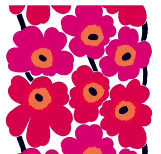
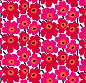
Marimekko


Key piece for analysis:


Vlisco


Wallace Sewell

Key piece for analysis:

Close up of fabric to analyse colour palette:


Comments